ProFinance
Client
Tietoevry Leasing
Year
2024
Services
Interface Design
Style Guides
Information Architecture
Accesibility Design
Challenge
THE WHY
The team was concerned about their Leasing software underperforming, being outdated and misaligned with the company's new modern identity.
Their legacy software needed to be integrated with the new design system, improving overall usability, productivity and efficiency for users.
The team was concerned about their Leasing software underperforming, being outdated and misaligned with the company's new modern identity.
Their legacy software needed to be integrated with the new design system, improving overall usability, productivity and efficiency for users.
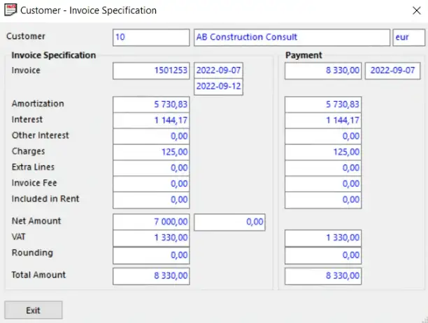
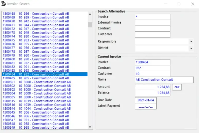


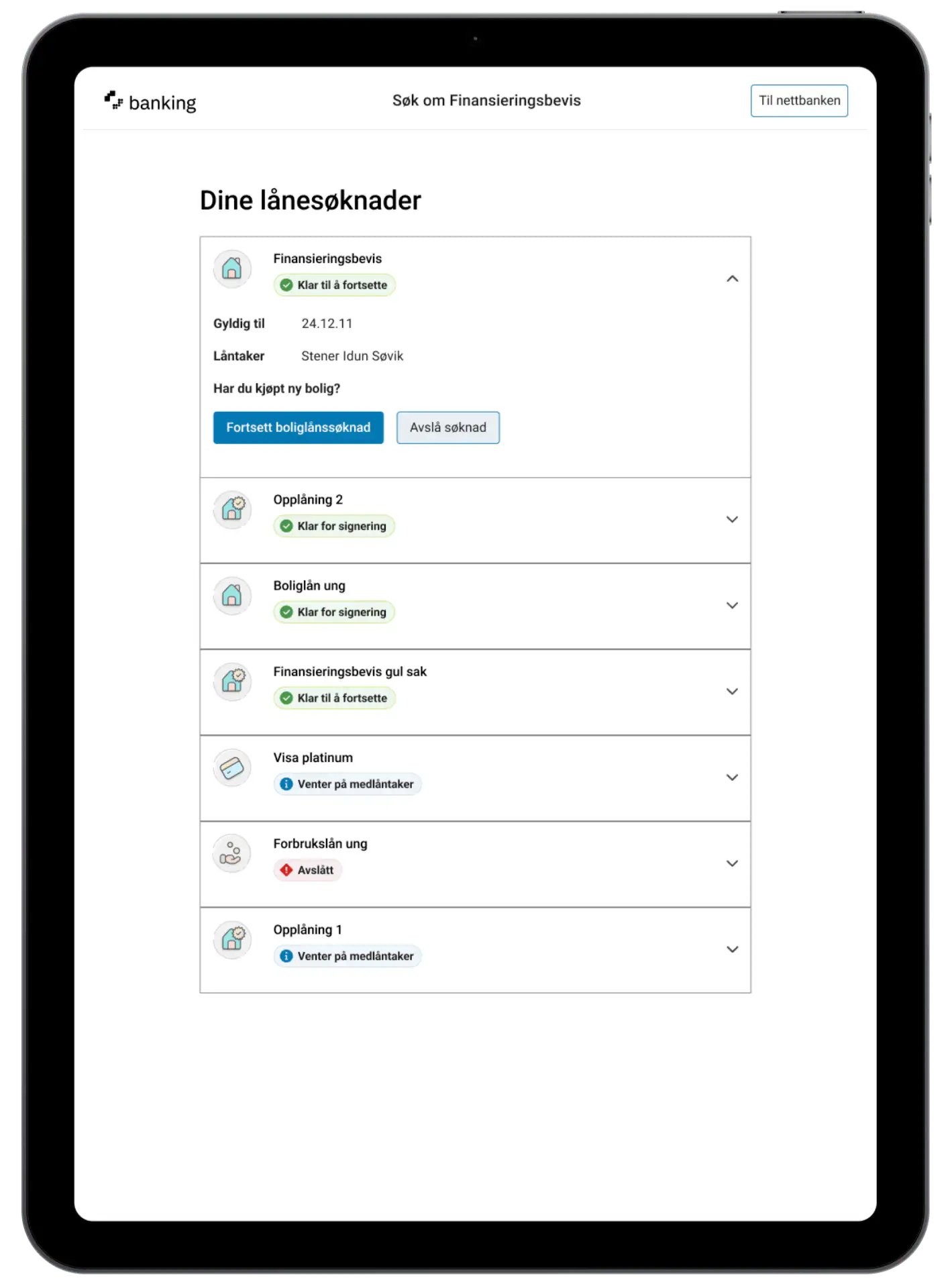
Preview of the old system workflow (above) and the new visual identity (below) it needs to be merged with.
Preview of the old system workflow (above) and the new visual identity (below) it needs
to be merged with.

Insights
THE hOW
Through screen walkthroughs, user interviews and workflow analysis, we observed patterns, behaviours and frustrations in real work scenarios.
The key friction points were users getting lost in overlapping windows and navigating complex workflows from memory, as the interface lacked structure and intuitiveness—slowing down multitasking and onboarding.
Design Decisions
THE WHAT
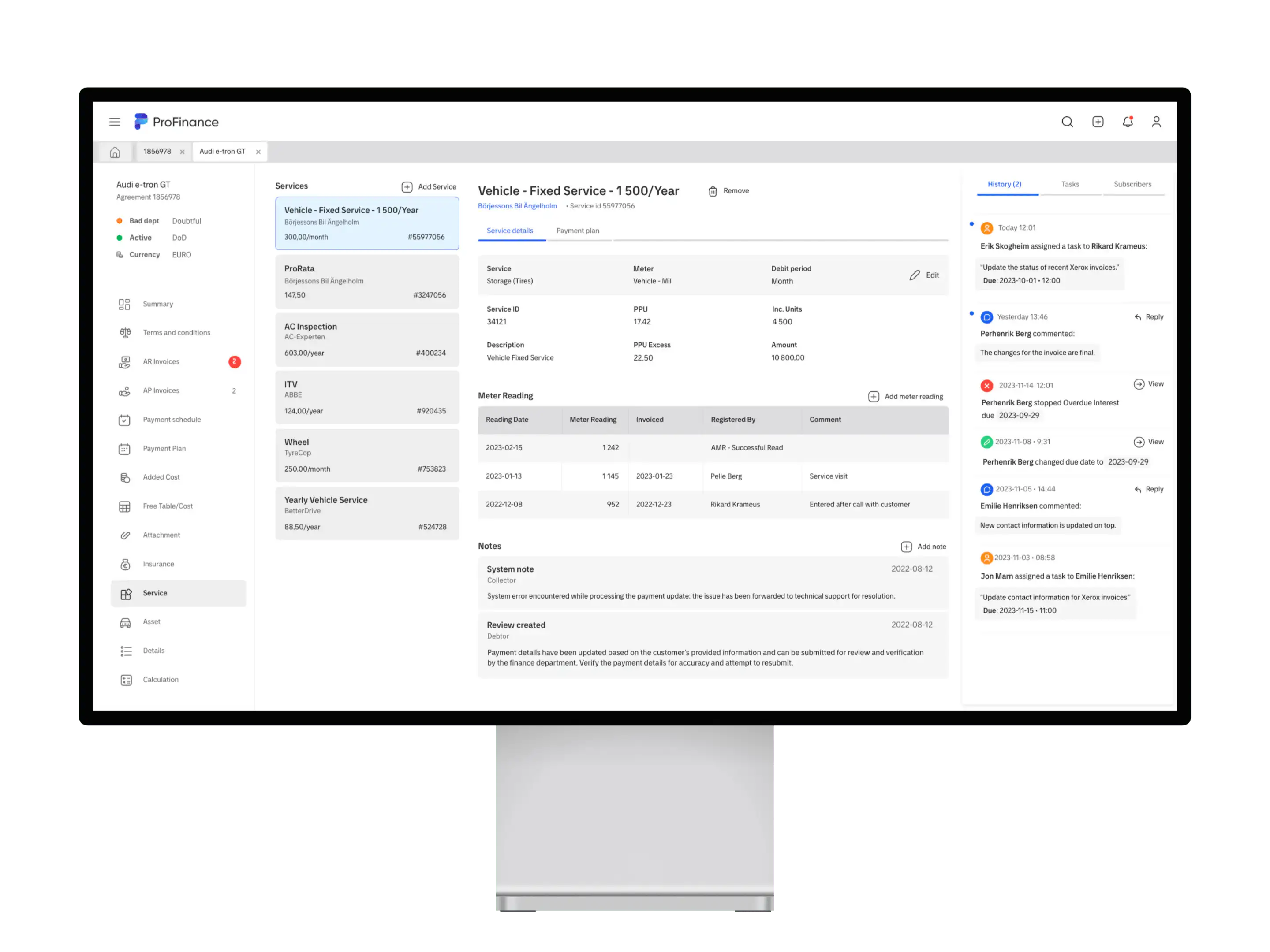
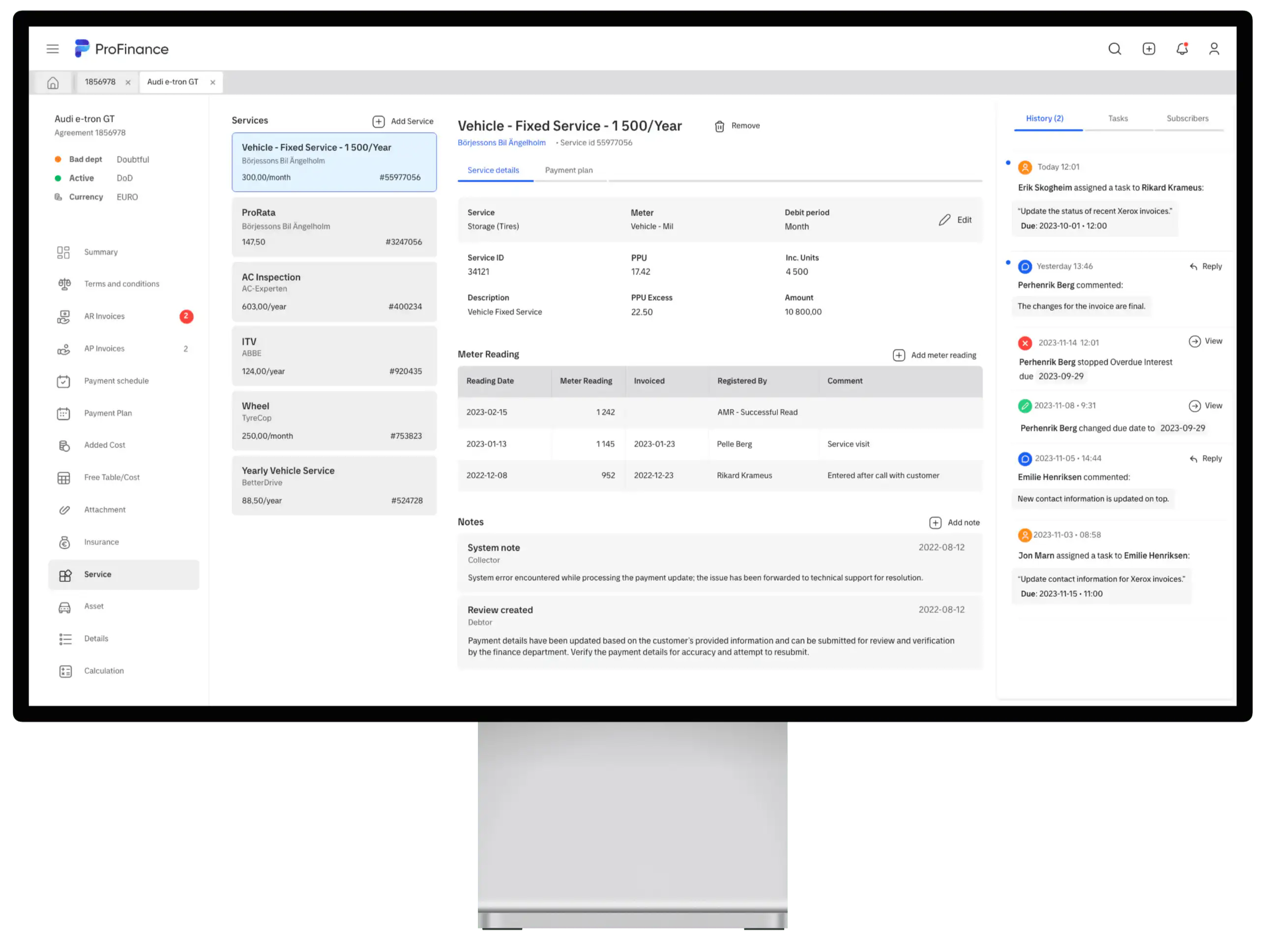
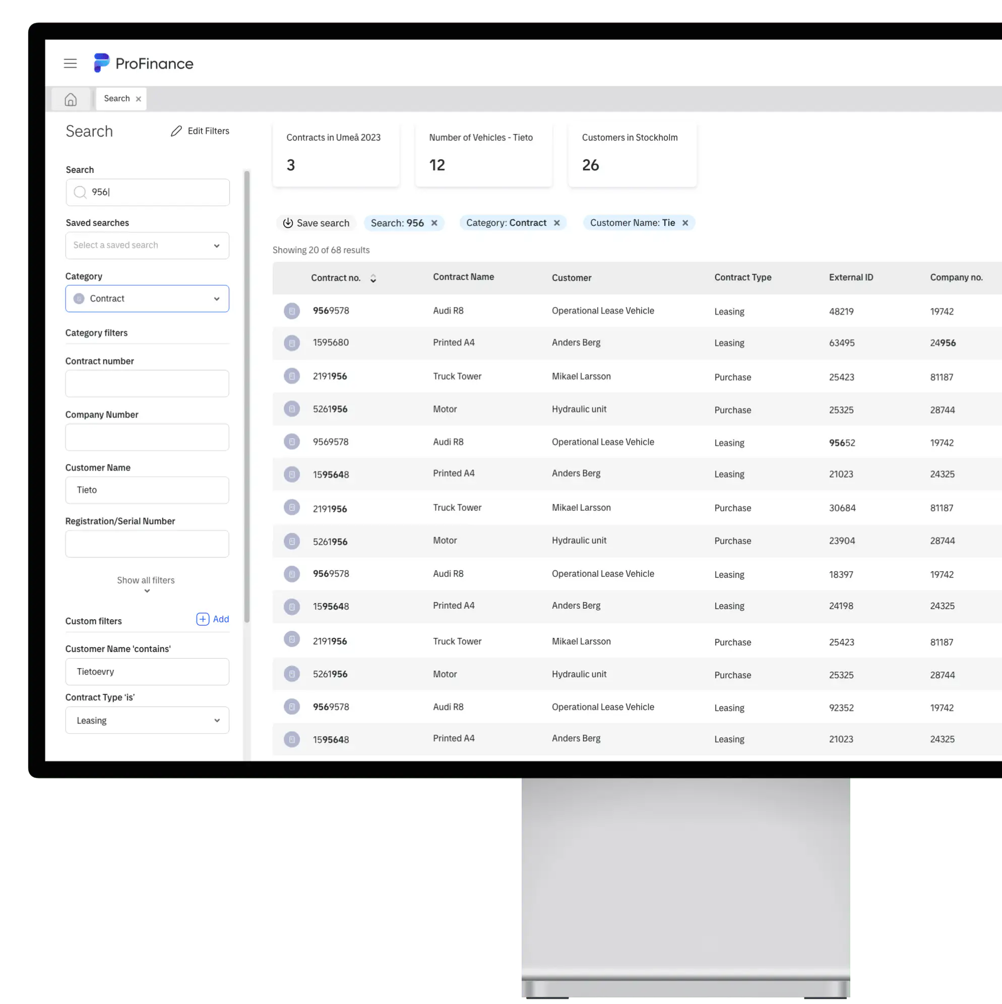
We restructured the information architecture establishing a clear hierarchy and improving the logic behind navigation and content placement, so that users could locate and process information faster with fewer errors.
The design implementations focused on grouping related data into tabs and compact views, introducing advanced custom search functionality and prioritizing visibility and consistency without ever losing context.
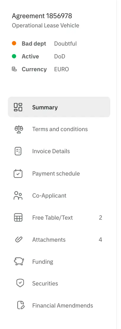
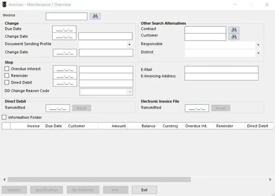
Sidebar menu with status.
Sidebar menu with status.
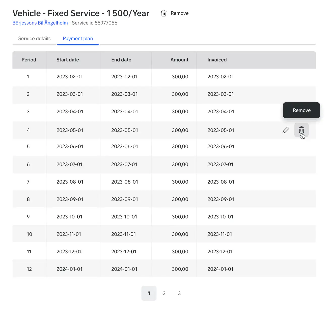
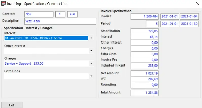
Table with payment plans.
Table with payment plans.
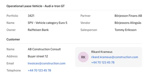
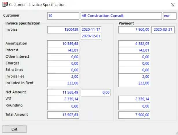
Lease and customer details.
Lease and customer details.

Compact Services overview.
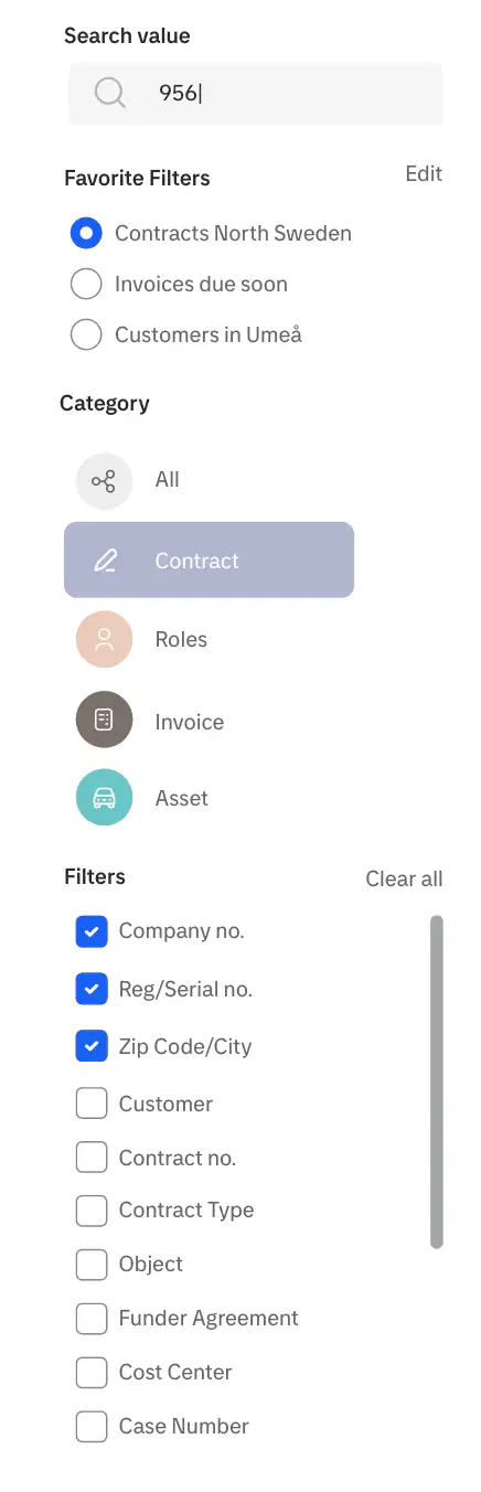
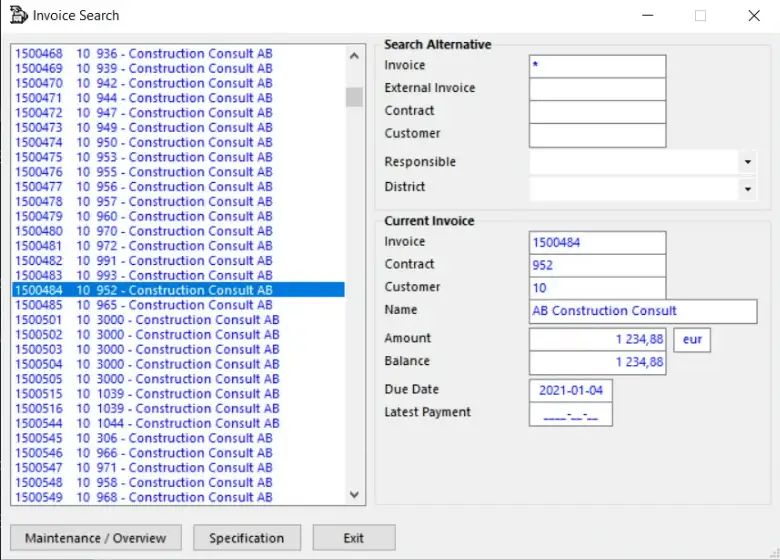
Advanced search filters.
Advanced search filters.
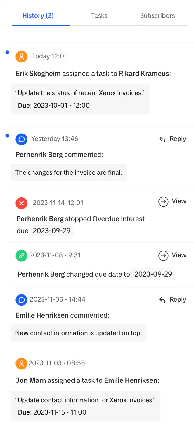
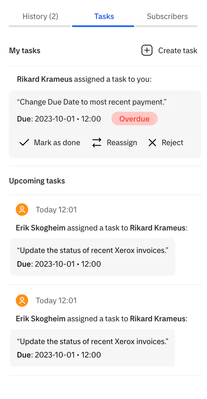
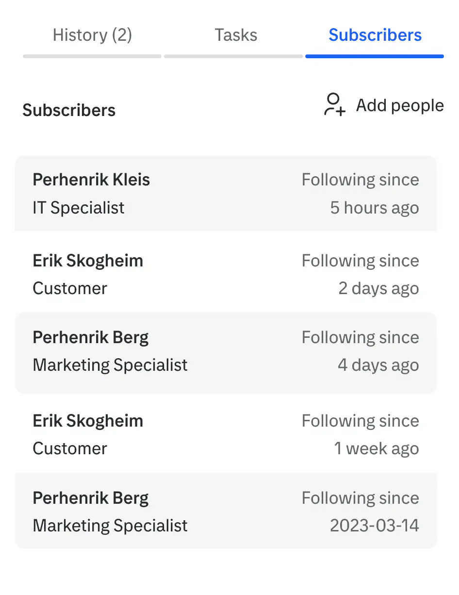
Context menu with three tabs.
Context menu with three tabs.

Solution
and Impact
Solution and Impact
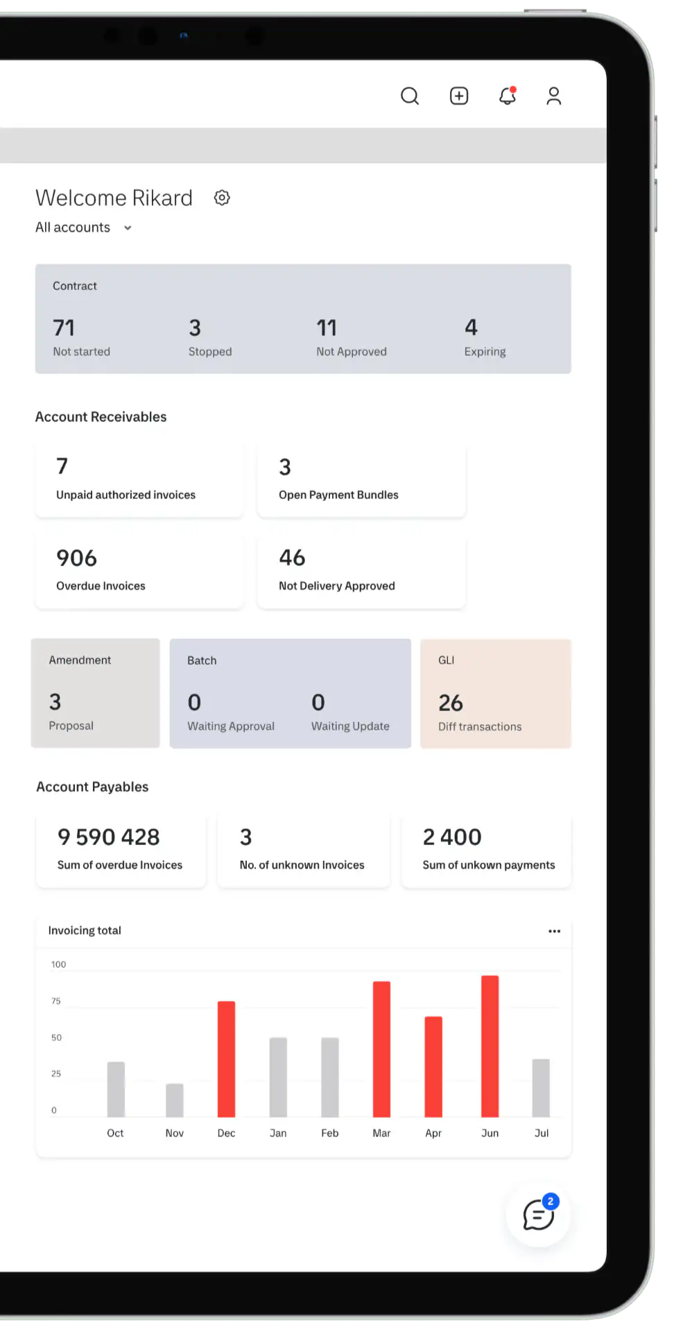
ProFinance introduced a modern, single-window layout that organizes task-related data into intuitive sections, improving focus and efficiency.
Post-launch feedback showed a noticeable drop in user errors, smoother navigation and faster onboarding, also ensuring future scalability.
ProFinance introduced a modern, single-window layout that organizes task-related data into intuitive sections, improving focus and efficiency.
Post-launch feedback showed a noticeable drop in user errors, smoother navigation and faster onboarding, also ensuring future scalability.

Solution
and Impact
ProFinance introduced a modern, single-window layout that organizes task-related data into intuitive sections, improving focus and efficiency.
Post-launch feedback showed a noticeable drop in user errors, smoother navigation and faster onboarding, also ensuring future scalability.

More projects


More projects